

This part is all about Halving.
The question is - where are we before the halving and going into next months? Are we accumulating & bottoming, are we heading up or are we close to blow-off? No one knows, however these charts will reveal some interesting short & long term trends.
These are not predictions. These charts are about where we are in between tops & bottoms or accumulation periods & blow-offs. The @crypto_volX index is indifferent to any price action. These charts are not for day trading or short term trades!
The best description is - where we are in crypto accumulation or blow-offs. Therefore the charts are most useful at peak fear - the peak depression or peak optimism - the peak mania.
The Halving Edition Includes:
Short term trends - a view into the short time span (weeks to few months).
Longer term trends - a view into the longer time frames (months to a year or two).
If interested into longer form view (3+ years), feel free to have look into the previous posts that are at the bottom of this post.
CHARTS
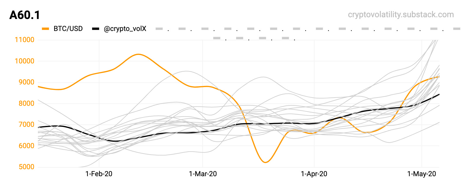
A60.1 All systems GO. Nothing else to see here. Will be crucial for the blow-off period!

B90.1 Again, all systems GO. Interesting one for the blow off period when it comes..

B90.2 This is same as B90.1, and suggest we are heading to break the price action from previous months. Again, it’s a possibility; not a prediction! This detailed charts will be part of paid subscription.
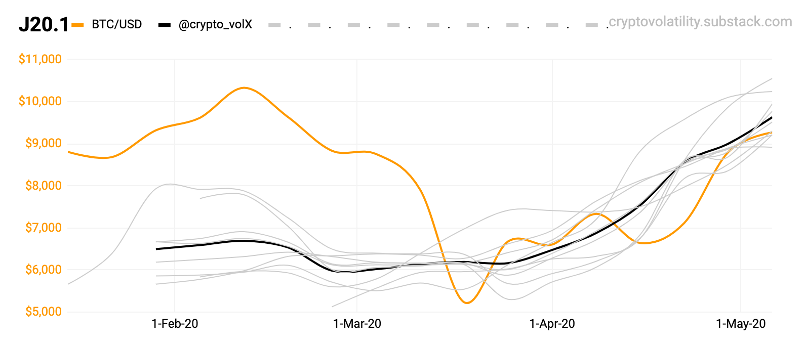
J20.1 Again, all systems GO - bottoming & front running the price action.
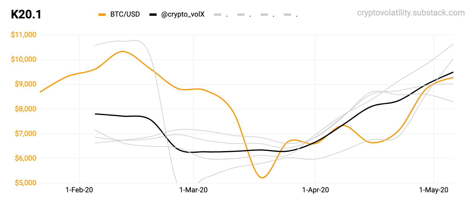
K20.1 Again, clear sign of front running the price action - continuation or exhaustion? We’ll see.

B10.3H The accumulation bottom from Q4/2019 is finally going upwards. The damage was done through global macro collapse.

B20.6H These two charts will react the same way. Just compare them.

B30.1 A key for lead & blow off period - either of the three indicators (black & grey).
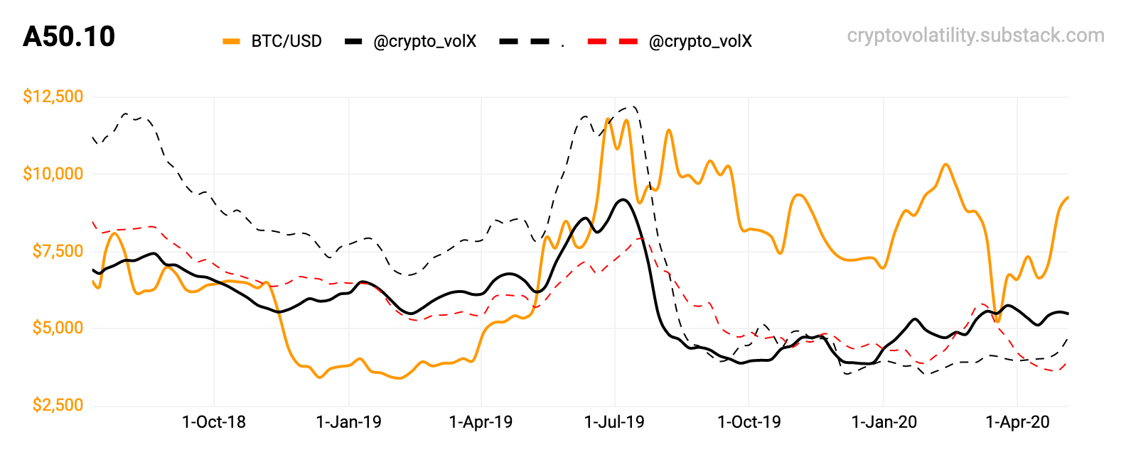
A50.10 See the long - bottoms in Q418, Q1/19 and then again in Q4/19 & Q1/20. The bottoming got exhausted. The long term trend is up.

A60.1 Just leaving it right here, as both - a leading for way up AND potential lead during the blow-off / exhaustion.
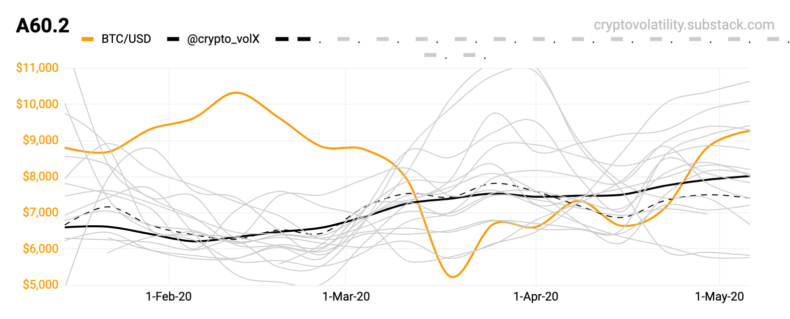
A60.2 This chart follows the previous one. They cannot exist without each other. Each of them leads in a different way though.
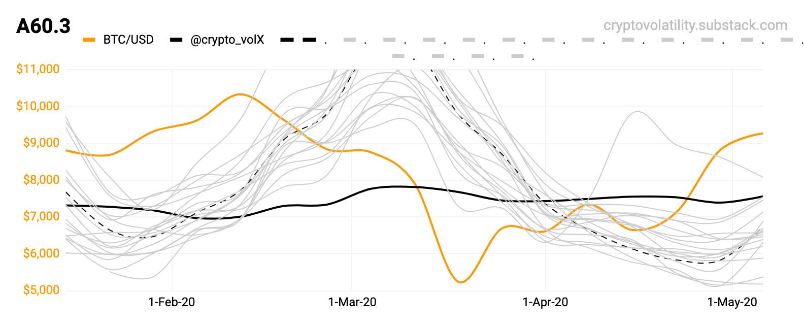
A60.3 Is a laggard compared with the previous two. It’s a great one to time the reversals with combination of previous two (A60.1 & A60.2).

H1.2 The long term trend is only - going upwards. There is not other choice here.

H4.1H Same as previous, the long term trend is only - going upwards. There is not other choice here.
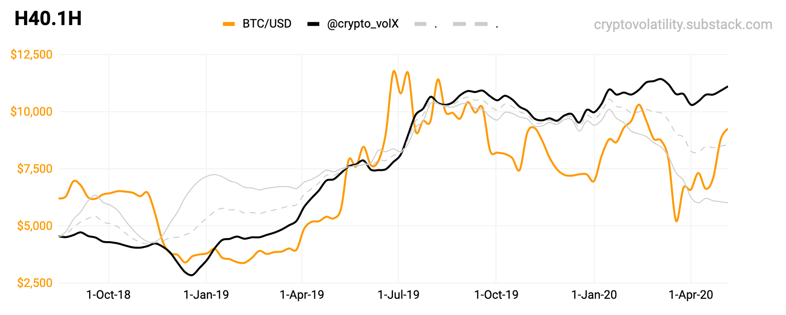
H40.1H A closer time frame look at the previous chart.
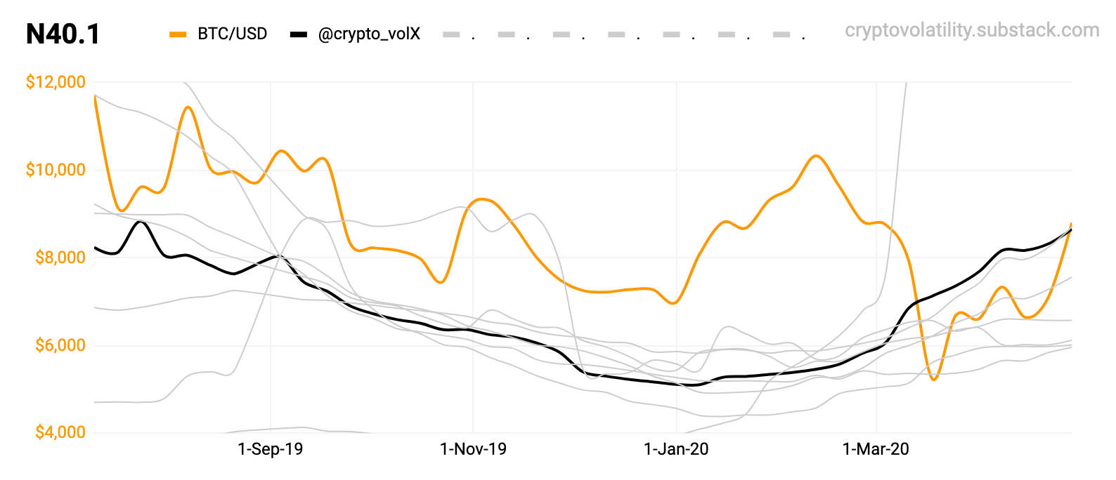
N40.1 The bottom confirmed & the trend reversal was clearly in - global macro does not matter. Will be great for timing next blow-off.

C40.1 Without comments.
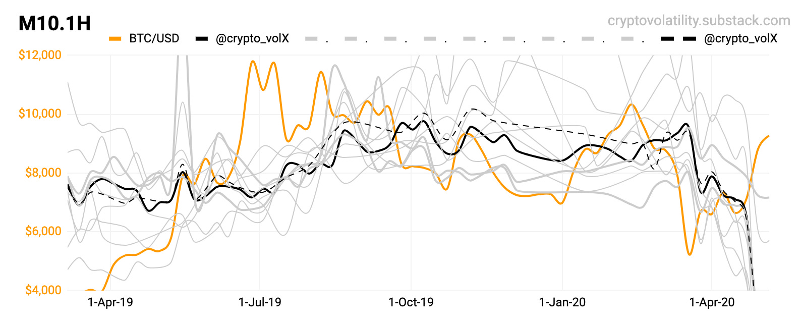
M10.1H This is what global macro damage looks like, a scary look. It will start to bottom & recover, however it should not be that depressing for now. If it took for months to recover - there would be a systemic problem.
Here are some older posts:
#9 Daily Addition.
#8 Magnum Opus.
#5 Other Charts.
#4 2013 - 2014.
#3 Global Tops.
#2 Local Bottoms.
That’s for today; enjoy, share or comment! Stay safe.